class-notes-final

SESSION B
 
Week 02: Image Inspiration, basic image editing for web and basic CSS
 
Introduction to CSS
CSS (Cascading Style Sheets) is the visual presentation language for web pages. CSS allows you to separate the content of a document from the details on how to display it. The details of how to display the document are known as its style. Advantage to keeping the style separate from the are:
  • Avoid duplication
  • Make maintenance easier
  • Use the same content with different styles for different purposes
Usually with HTML, you use the markup language to create content of the document, not its style. You use CSS to specify its style, not its content. For instance, in HTML you can use a <b> tag to make text bold, and you can specify the background colour of a page in its <body> tag. When you use CSS, you avoid using these features of HTML so that all your document’s style information is in one place.
 
CSS Syntax
CSS rules are have two main parts: a type selector, and one or more property/value pair . The selector is typically the HTML element you want to style. Each property/value pair is composed of a property and a value. The property is the style attribute you want to change. These come in wide varieties, which can affect attributes such as text color, background color, the position of the element on the page, font type, border color and thickness, and many other appearance and layout controls.
 
week02-07
 
The HTML element this rule affects is 
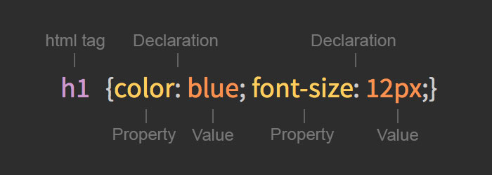
<h1> — every <h1> in the HTML document or documents that this CSS rule is applied to will display with these styles, unless they have more specific rules also applied to them, in which case the more specific rules will override this rule. The properties affected by this rule are the color of the text (blue), and the font size of the text (12px) inside the <h1> tags.
 
 
CSS Selectors
Element selector – An element selector matches all the elements of that name on the page (< p > elements, in the case below). By specifying an HTML tag, you can affect all page elements that are surrounded by that tag. If you review the list of HTML Elements from last week you will have a list of html element you can apply CSS styles to.
 
p {}

Class selector – A class selector matches all elements that have a class attribute with the value specified, so the below would match <p class=”example”>, <li class=”example”> or <div class=”example”>, or any other element with a class of example. Note that class selectors do not test for any specific HTML element name.

.example {}

ID selector – An ID selector matches all elements that have an id attribute with the value specified, so the above would match<p id=”example”>, <li id=”example”> or <div id=”example”>, or any other element with an id of example. You can only have one of each ID per HTML document – they are unique to each page.

#example {}

CSS Pseudo Classes

:link – lets you link to elements in your HTML.
:visited – Selects links that have already been visited.
:hover – Selects the link when the users mouse hovers over the link text.
:active – Selects the link while it is being activated (being “pressed”)

a:link {color:#FF0000;}      /* unvisited link */
a:visited {color:#00FF00;}  /* visited link */
a:hover {color:#FF00FF;}  /* mouse over link */
a:active {color:#0000FF;}  /* selected link */
 
CSS Width

The width of an element depends on its display type (block or inline). Block level elements have a default width of 100%, taking up the entire horizontal space available. Inline elements expand and contract horizontally to occupy their content. Since inline elements cannot have a fixed size, the width property is only relevant to block level elements.

div {
        width: 400px;
    }


CSS Height

The height of an HTML element is determined by its content. The element will contract and expand vertically as needed to accommodate its content. To set the height of a block level html element you must use the CSS height property. Like the width property, the height property only applies to block level elements.

div {
        height: 100px;
     }


CSS Margin

The margin property sets the amount of space surrounding an html element. Margins fall outside of the border and are transparent. Margins can be used to position elements within a particular space on a page or to simply provide between elements.

     div {
                 margin: 20px;
          }


CSS Padding

The padding property is similar to the margin property, however it falls within any elements border. Paddings will also inherit any backgrounds colors or images of an element. Padding is used to provide spacing within elements.

 div {
             padding: 20px;
    }


CSS Margin and Padding Declarations

There are both long hand and short hand values for margin and padding. To set one value for all four sides of an element simply specify one value. This will set a 20px margin and padding around the entire element.

div {
            margin: 20px;
            padding: 20px;
   }
 
 
To set one value for the top and bottom and another value for the left and right of an element specify two values, top and bottom first then left and right.
 
 div {
            margin: 10px 20px;
   }
 
 
To set unique values for all four sides specify them in the order of top, right, bottom, and left.
 
div {
            margin: 10px 20px 15px 0;
 }
 
 
Additionally, you can set the value for one side at a time using a unique property. Each property starts with margin or padding respectfully and is then followed with a dash and the side of the box to which the value is to be applied, top,right, bottom, or left. As an example, the padding-left property takes one value and will set the left padding for that element.
 
div {
            padding-left: 10px;
  }


CSS Borders

Borders fall between the padding and margin of HTML elements and provide an outline around an element. Every border needs three values, a width, style, and color.

div {
         border: 10px  solid red;
  }
 
 
CSS for Web Page layout
CSS can be useful for far more than simple visual changes like color or font-size. You can use CSS to specify various visual effects that change the layout of your document. 
 
Advanced CSS Selectors
 
CSS box model
Every HTML element in web design is a rectangular box and may include margins, paddings and borders. For instance, take a look at the image below. Note how every element is surrounded by a rex box. Each image, line of text, every link. They are all boxes. 
 
box-model-2a
Understanding the box model can be a bit difficult but crucial in order to build successful websites.
 
As you remember, every element in a web page is a rectangular box. The box begins with the height and width of the element, which can be determined by the type of html element, the contents of the element, or by specified height and width properties for the element. 
 
The old and incorrect box model
 
Then padding and border is added to the size, finally margin follows the border. Although margin is not included inside the box it does define the elements box model.
 
div {
           background: #fff;
           border: 6px solid #ccc;
           height: 100px;
           margin: 20px;
           padding: 20px;
           width: 400px;
       }
 
 
The correct box-model
Is initiated by applying box-sizing: border-boxGlobally to all the elements. Then padding and border is removed from the width size.

/* apply a natural box layout model to all elements */
*, *:before, *:after {
  -moz-box-sizing: border-box; -webkit-box-sizing: border-box; box-sizing: border-box;
 }

 Box sizing demo – http://codepen.io/clzd/pen/JkGHK


Floating Elements
The float property allows you to take elements and float them right or left, positioning them directly next to or opposite each other.

 
Take a look at the common web page layout with a section and an aside. Normally, the section and aside, as block level elements, will be stacked on top of one another by default. However, we want them to sit side by side. By giving each element a specific width and floating one of them left and the other to the right we can position them correctly.
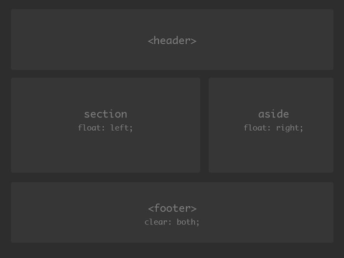
 
week02-09
 
When floating an element it is going to float all the way to the edge of its parent container. If there isn’t a parent element it will float all the way to the edge of the page. Additionally, when floating an element other elements will begin to line up around it within the natural flow of the page.
 
Instructor tips
Have the students open the original class workshop html (week01-basic.html) and use it as a starting template for the code listed below. Walk them through adding the header, section, aside and footer HTML elements and the inline CSS tags.

Basic float HTML

<!-- this is a basic html document -->
<!DOCTYPE html>
<html lang="en"]]>

        <head>
                <meta charset="utf-8"]]>

                <title>CSS floats for layout</title>

                <style type="text/css"]]>

                        header {}
                        section {}
                        aside {}
                        footer{}
                </style>

        </head>
        <body>
                <header>header</header>
                <section>section</section>
                <aside>aside</aside>
                <footer>footer</footer>
        </body>
</html>
 
Instructor tips
Walk the students through adding the CSS styles for the header, section, aside and footer HTML elements listed below.
 
 
html, 
body {
        background-color: #222;
        padding: 5em 10em; 
}

header {

        padding: 50px;
        margin-bottom: 20px;
        background-color: #ccc;
}

section {
        background-color: #ccc;     
        min-height: 400px;  
        float: left;
        width: 60%;        
}

aside {
        background-color: #ccc;     
        min-height: 400px;  
        float: right;
        width: 30%;                                
}

footer{
        padding: 50px;
        clear: both;
}
 
 
Clearing floated elements
When elements are floated, they break the normal flow of the page and other elements will wrap around the floated one as necessary. Sometimes this is good, such as when floating an image to the side of a block of content so the text flows around it, and sometimes this is bad.
 
To float an element, or handful of elements, and then return the document to its normal flow you use the clear property. The clear property acts on the element it is applied to and returns the document back to its normal flow, clearing every floated element up to that point.
 
In the example above, with the section and aside floated, we want to apply a clear to the footer to force it to fall below the two floated elements.
 
footer {
        clear: both;
}
 
Positioning elements
You can also use the position property to align elements. The position property comes with a couple of different values, all of which have different functionalities behind them.
 
The default position value is static, which keeps elements within their normal flow. The relative value allows you to use box offset properties such as top, right, bottom and left. The absolute and fixed values work with box offset properties too, but break the element from the normal flow of a document. These values, absolute and fixed, correspond directly with an elements parent who has a position value of relative.
 
Relatively positioned elements maintain their position within the flow of the document. You can position them relatively from their original place in the flow of the document. When you place an absolute positioned element within a relatively positioned element, you are creating a positing context for the absolutely positioned elements. Essentially, relatively positioned elements create a ‘positioning context’ for their absolutely positioned children.
 
week02-10
 
Instructor tips
It is strongly suggested that you open the original ‘hello-world’ class workshop html from week 01 and use the html elements inside of it alongside with the chrome developer tools to demonstrate the box model and all the box model and positioning examples given above to the students.
 
Have students open the pwd.week02.positioning-context.html file and follow along with you as you explain positioning context.
 
  • Class Workshop: Expanding on Simple “Hello-World” Website
    • Expanding on Last weeks website
    • making horizontal floated nav
    • add links to images
    • Code simple one-page website, with short descriptive text, email link and 3 link navigation (for homework)
  • Home Assignment 
    • Students to Improve upon their simple 3-page hello-world website, by Adding personal/custom images, Css styles,  and simple navigation layout
 

Subscribe To Our
Mailing list

 I'd love to share my business experience to help you build your brand through websites & Social Media to enhance your platform.

You have Successfully Subscribed!