SESSION A
Week 04: Building Websites rapidly using CSS grid systems (Unit 04)
Week 03 review
- HTML5 Boilerplate is the product of years of industry best-practices. Developed by Paul Irish and Divya Manian over more than two and a half years in constant development.
Essentially it is just a great starting template for your web pages because its full of best practices and techniques for creating cross-browser websites that will work with older browsers (which means IE 6) while also being HTML5-ready.
-
Bootstrap is a framework of carefully crafted html/css/js components, free to use, for creating websites and web applications. It contains HTML and CSS-based design templates for typography, forms, buttons, navigation and other interface components, as well as optional JavaScript extensions. Bootstrap was developed by Mark Otto and Jacob Thornton while working at Twitter in order torpidly build web apps.
It remain as the most popular project on Github and has been adopted for use by NASA and MSNBC among others.
Instructor tips
Quickly review the html5 boilerplate again and summarize why it is good. Go through all the bootstrap elements again, remind them how easy it is to create perfect web design components with the use of css classes
Ask students if they have any questions or if they had any difficulties completing the homework assignment. Try to include the class in the trouble-shooting and solution to each others issues.
Diving into Bootstrap CSS grid system
The new Bootstrap grid has been totally rebuilt from the ground up with a mobile-first approach. Which means that you design for smaller devices first and then scale your design and web page functionality up for larger and larger devices. This is called adaptive or responsive design. We won’t get too deep into responsive web design as it is a vast subject that requires a lot of explanation and study.
Instructor tips
For the purposes of this class we will just be using the .col-xs-* classes which render and scale the same in all devices. If you find yourself with a group of students that seem to grasp all the concepts easily you may want to delve into RWD just a bit.
Below is an example of a basic bootstrap page set up. Have the students open week04-grid.html. Its important that they begin from the particular document because it contain specific css styles to display the grid examples visually. Have them follow along with you as you mark-up the different grid examples below.
We start with the basic html code for the grids.
<!DOCTYPE html>
<html>
        <head>
                <meta http-equiv="content-type" content="text/html; charset=windows-1252">

                        <title>Bootstrap 3 Grid Tutorial</title>
                        <meta name="viewport" content="width=device-width, initial-scale=1.0">


                   <!-- Latest compiled and minified CSS -->
       <link rel="stylesheet" href="http://netdna.bootstrapcdn.com/bootstrap/3.0.0/css/botstrap.min.css">


                        <!-- MAKE SURE TO ADD YOUR  STYLES LAST -->
                        <style type="text/css">
 </style>

        </head>
        <body>

                <!-- put your grids in here! -->

        </body>
</html>
Lets start with a basic structure of the Bootstrap grid system. Lets takes this step-by-step:
- Create a div element and give it a class of “.container”.
- Inside the “.container” create another div, give this a class of “.row“. Inside of the “.row” element we place another div with a “.col-xs-12” class.
<div class="container">
        <div class="row">
                <div class="col-xs-12"> Full width </div>
        </div>
</div><!-- /container-->
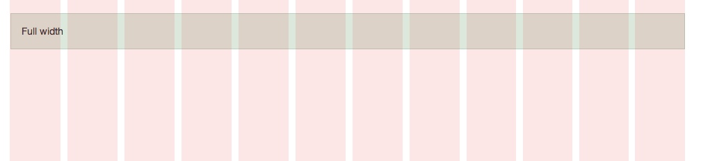
The example above renders a full-width container, because it is twelve columns in width. Each ‘.row’ should add up to twelve columns.
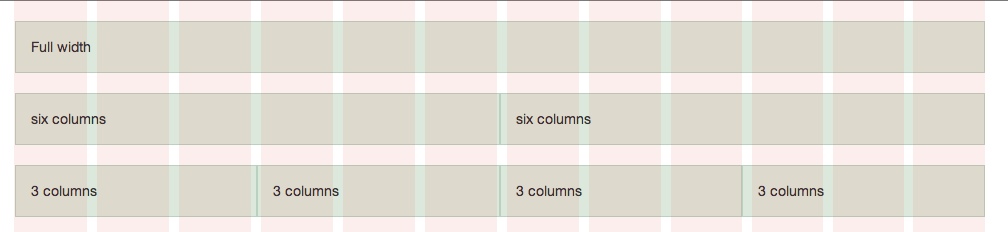
Lets add another “.row” div. Inside of this element place two more div’s with the classes “.col-xs-6”. Which creates a 6 column element. 6 + 6 = 12. To have four columns in a ‘.row’, simply give each ‘.col-xs-3′ class tag, as 3 + 3 + 3 + 3 = 12. As long as the columns in any given ‘.row’, add up to twelve your layout will work.
<div class="container">
        <div class="row">
                <div class="col-xs-12"> Full width </div>
        </div>

        <div class="row">
                <div class="col-xs-6"> six columns </div>
                <div class="col-xs-6"> six columns </div>
        </div>

        <div class="row">
                <div class="col-xs-3"> 3 columns </div>
                <div class="col-xs-3"> 3 columns </div>
                <div class="col-xs-3"> 3 columns </div>
                <div class="col-xs-3"> 3 columns </div>
        </div>

</div><!-- /container-->
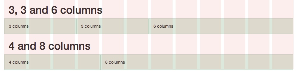
You can mix and match column numbers to create typical website layouts where there is a bigger area for content and one or two smaller areas for ancillary information and links. In this example we placed two more “.row” with varying numbers of columns. Remember, as long as your columns equal 12 your layout will work.
<div class="container">
        <h1>3, 3 and 6 columns</h1>
        <div class="row">
                <div class="col-xs-3"> 3 columns </div>
                <div class="col-xs-3"> 3 columns </div>
                <div class="col-xs-6"> 6 columns </div>
        </div>

        <h1>8 and 4 columns</h1>
        <div class="row">
                <div class="col-xs-8"> 8 columns </div>
                <div class="col-xs-4"> 4 columns </div>
        </div>
</div><!-- /container-->
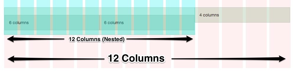
You can nest grids within columns. When you nest a grid, the same 12-column rule applies. For instance, lets nest another grid inside the 8 columns grid section. Note that the columns inside the nested element equals 12 columns.
<div class="container">
        <div class="row">
                <div class="col-xs-8">
                        <div class="row">
                                <div class="col-xs-6">6 columns</div>
                                <div class="col-xs-6">6 columns</div>
                        </div>
                 </div>
                <div class="col-xs-4"> 4 columns </div>
        </div>
</div><!-- /container-->
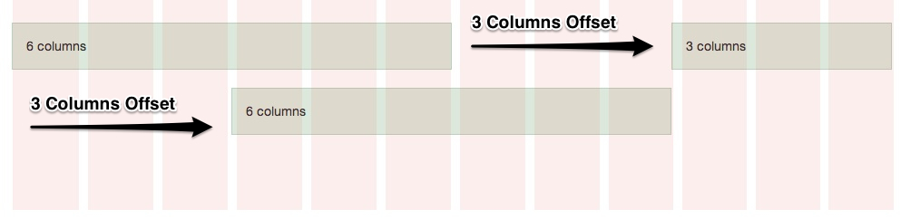
You can offset grids using the a similar grid column naming convention. Look at the “col-offset-*” classes. This class “pushes” the element whatever number of columns you specify in the class name. In this example we are offsetting the divs by 3 columns.
<div class="container">
        <h1>Offset columns</h1>
        <div class="row">
                <div class="col-xs-6"> 6 columns </div>
                <div class="col-xs-3 col-sm-offset-3"> 3 columns </div>
        </div>

        <div class="row"]]
>

                <div class="col-xs-6 col-sm-offset-3"> 6 columns </div>
        </div>
</div><!-- /container-->
Instructor tips
For the purposes of this class we will just be using the .col-xs-* classes which render and scale the same in all devices. If you find yourself with a group of students that seem to grasp all the concepts easily and you find yourself with more time then you should explore some of the other device media queries. Mock up a website for the students that adjusts to different device widths.
Extra Small Class demo
The Extra Small class will render / scale the same in all device widths.
Small Class demo
The Small class will form a single column on smartphones.
Medium Class demo
The Medium class will form a single column on tablets and smartphones.
Large Class demo
The Large class will form a single column on small desktops / laptops, tablets, and smartphones.